Prestige Communications — Brand Identity & Bilingual Website
Overview
Prestige Communications is a BTL and digital marketing agency in Athens, founded under the guidance of the Athens Publishing Centre and ATERMONO, which have served advertising and the graphic arts for fifty years. It runs promotional activations, special events, exhibitions and digital campaigns for brands in automotive, spirits, retail and lifestyle, from Athens and Thessaloniki to Crete and the islands. The identity came first — the Couture P, a monogram whose inner curve hides the silhouette of a chat bubble, set beside a PRESTIGE wordmark and a palette of gold, black and cream — and the site was built on that system, so the brand and the site share one set of decisions.
Greek leads: the site opens in Greek, Greek fills any string the English lacks, and search engines are told it is the default. The home page opens on the monogram as film — a macro of brushed metal that turns and pulls back to the whole P as you scroll — and the About page stands it up as a monolith before handing the headline over to WE ARE PRESTIGE, WE ARE THE FUTURE. Eight values spell P-R-E-S-T-I-G-E and light from cream to gold one at a time as the section scrolls, under gold dust the pointer pushes around like a breeze. Behind the showpieces is a working site: a photographic portfolio in four categories, a wall of fifty client logos, three service pages with their own questions and answers, a contact form, and a casting application for promoters, hosts and models.
Challenges
An agency that sells presence needed a site that felt like the brand before anyone read a word — and the brand did not exist yet, so the identity had to come first and then carry the site. Its typefaces were the first obstacle: the display face, Orpheus Pro, is a licensed Adobe font that cannot be served on the web, and the body face, Poppins, has no Greek at all, on a site whose primary language is Greek. Gold on black is the whole palette, and type over moving footage fails contrast in patches a frame average never shows. The client's material arrived as it was: 47 logos in six formats, 23 of them dark artwork invisible on a black page and a dozen with white boxes baked in; 24 event photographs; a phone-shot activation reel. And the agency recruits through the site, so a public form collects photographs, CVs and personal details — GDPR data from the moment they arrive.
Solutions
The Couture P is a single bespoke letter whose bowl holds a hidden chat bubble, paired with a PRESTIGE wordmark, a letter-spaced COMMUNICATIONS line and a palette of Prestige Gold, Deep Black and Soft Cream, and delivered as a full suite: horizontal, stacked and symbol lockups in dimensional, gradient and solid finishes, for light and dark grounds. The site keeps to that system without the licensed files. Font tokens resolve the display face to Noto Serif Display and split the body face by Unicode range, Poppins for Latin and Manrope for Greek, so one token draws the right letters in either language. The monogram films are scrubbed by scroll, encoded with a keyframe every six frames so any seek decodes at once, and fall back to a single frame under reduced motion and to a lighter encode on small screens. Every line of type over footage was measured at its worst 6×6-pixel patch rather than the frame average, and each scrim was sized from that number. The logos were trimmed onto transparency at one optical height and set on white chips, the one ground every mark was drawn for. Applicant photographs are rewritten to WebP within 50 KB and PDF CVs over 400 KB recompressed before they are stored, outside the web root. Fonts, video and scripts all come from the site's own host, so no visitor is handed to a third party.
Gallery
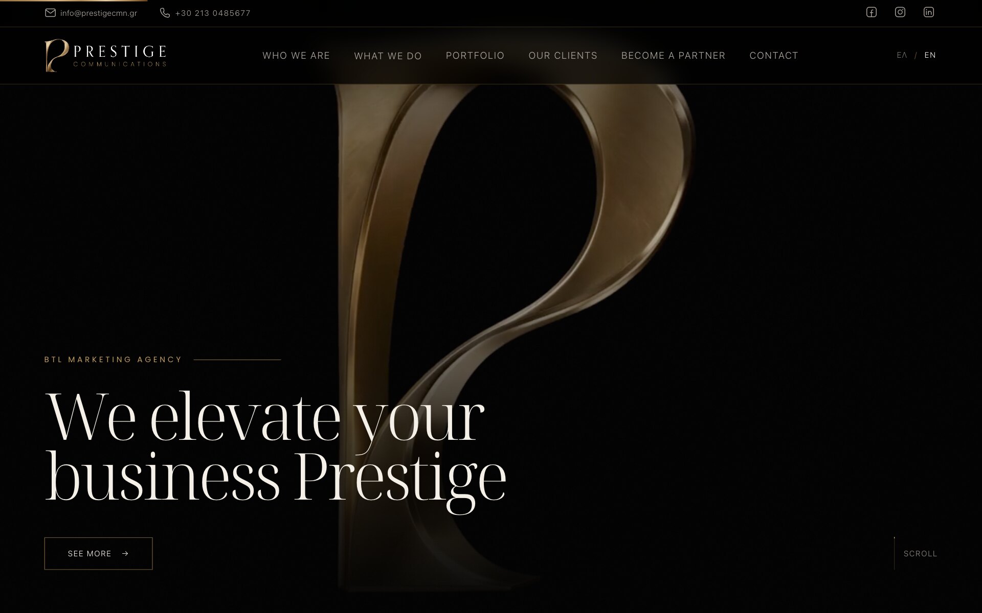
A Home Page That Opens on the Monogram, as Film
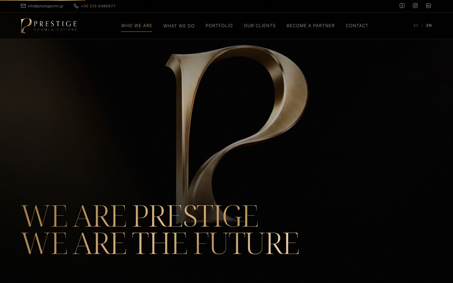
Who We Are — The Mark as a Monolith, Scrubbed by Scroll
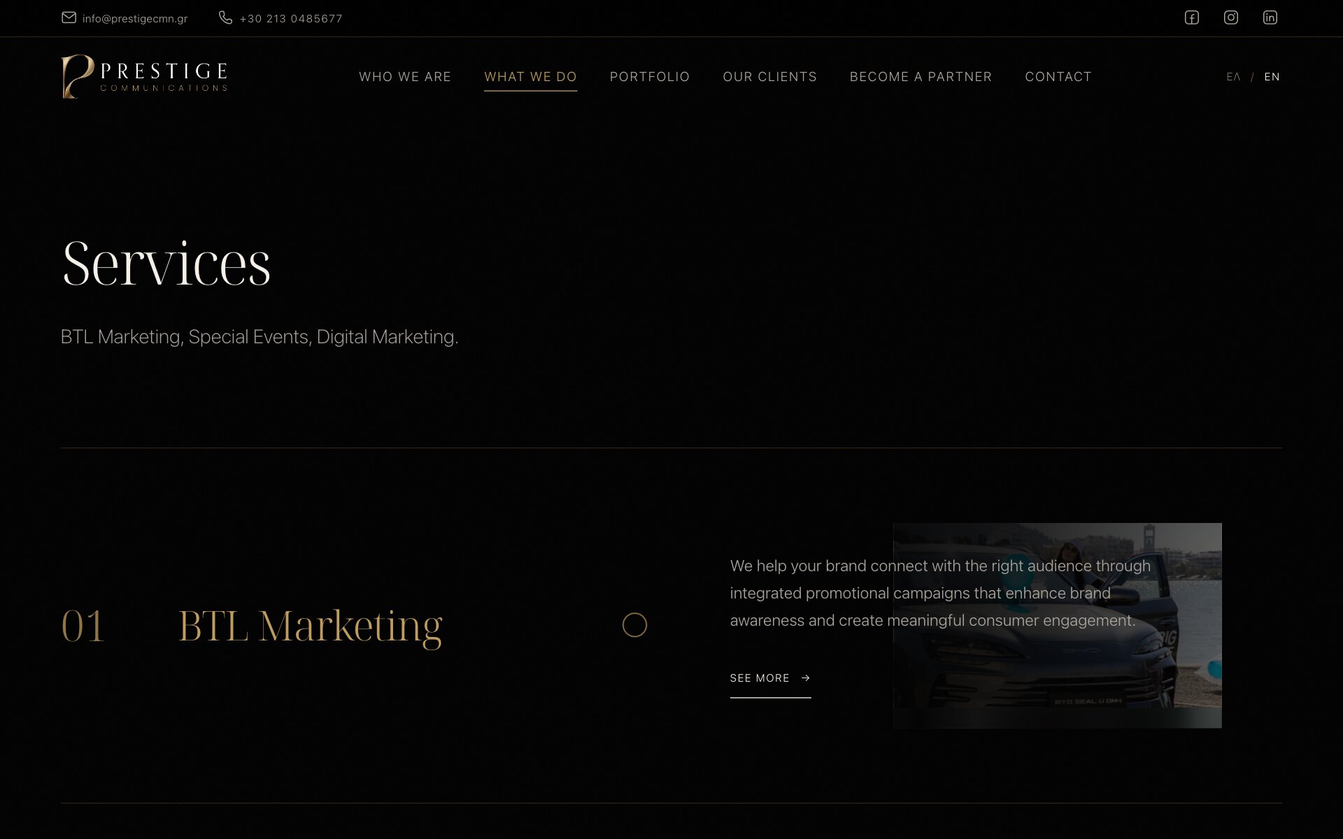
A Hover Preview That Keeps the Copy Legible
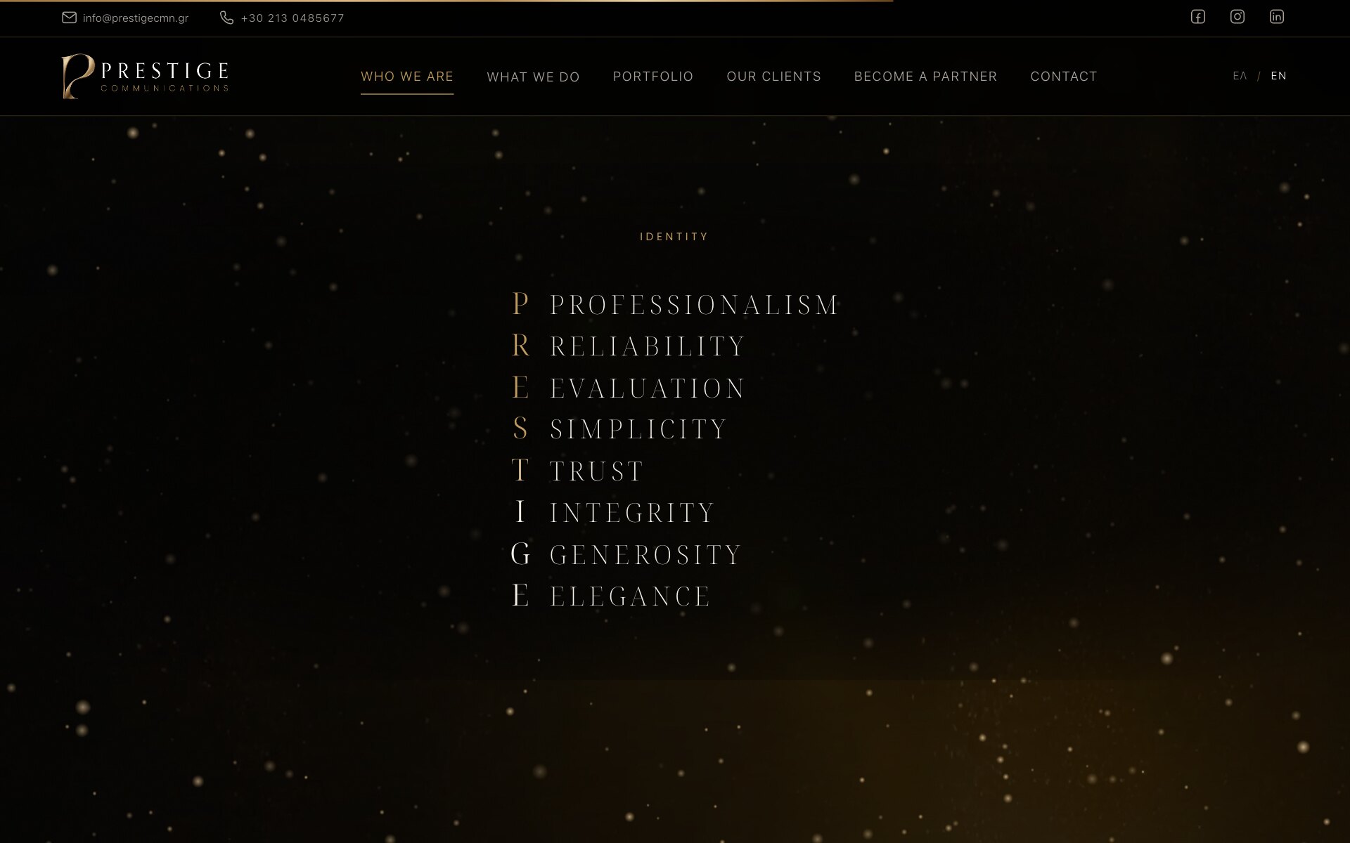
Eight Values, One Acrostic, Lit Gold Letter by Letter
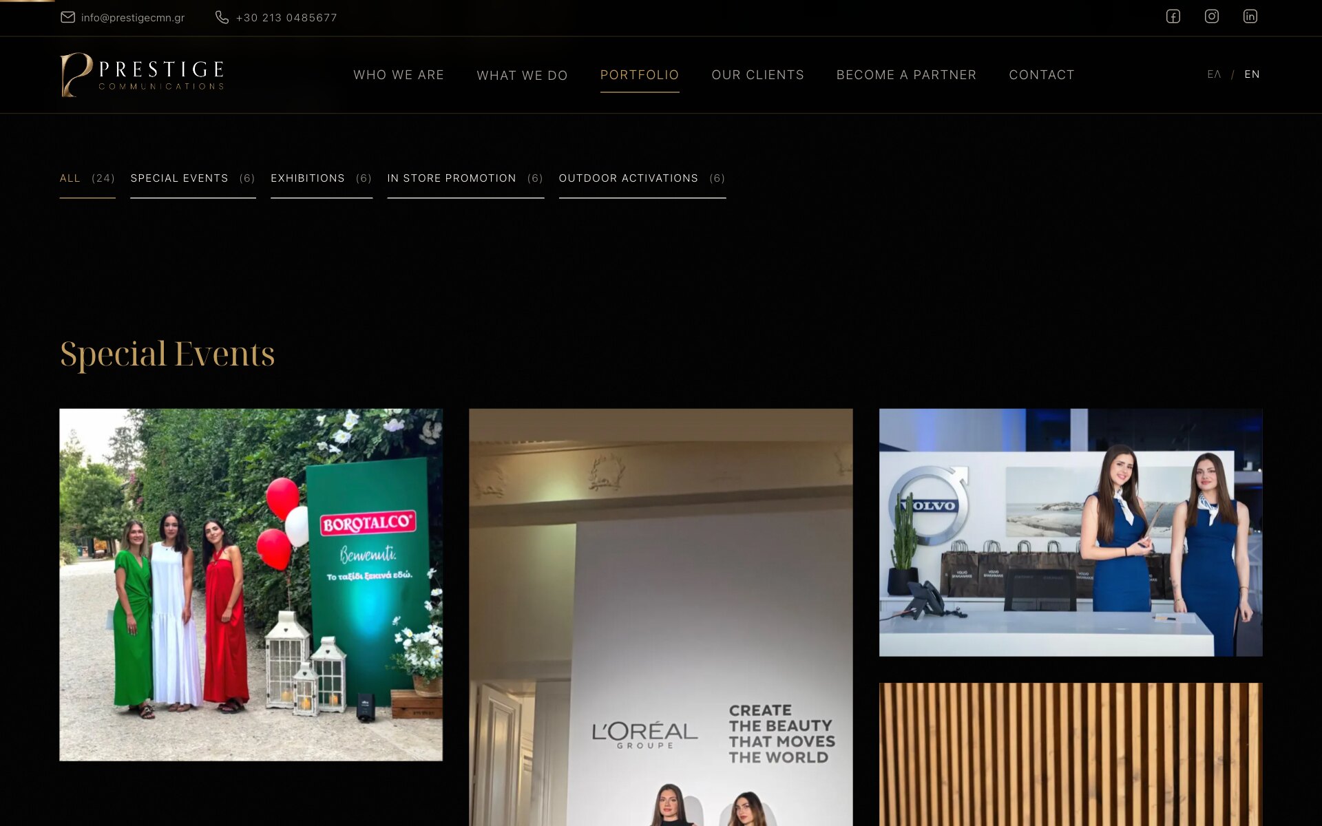
Twenty-Four Photographs of the Agency's Own Work
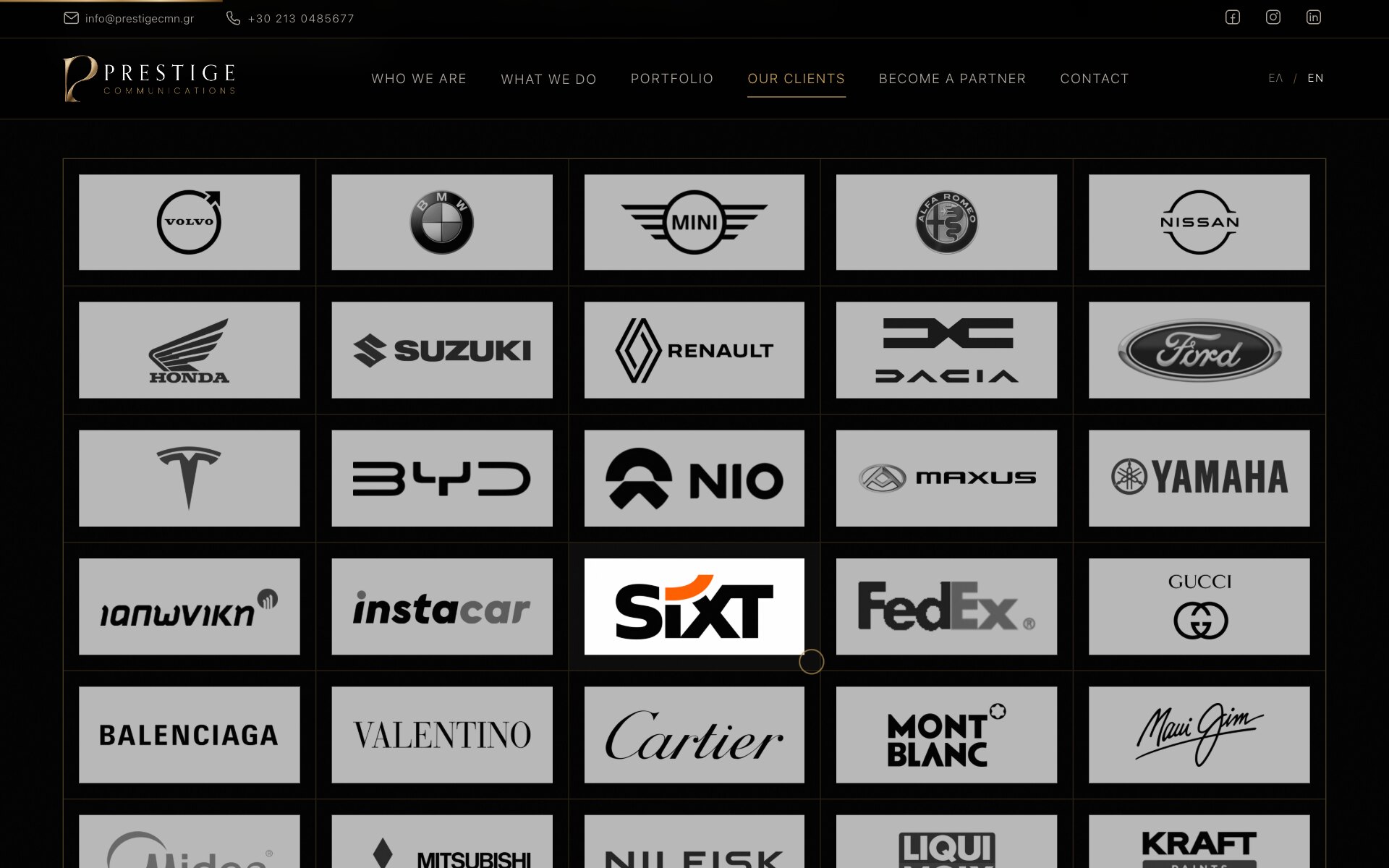
Fifty Client Logos, Normalised onto One Light Ground
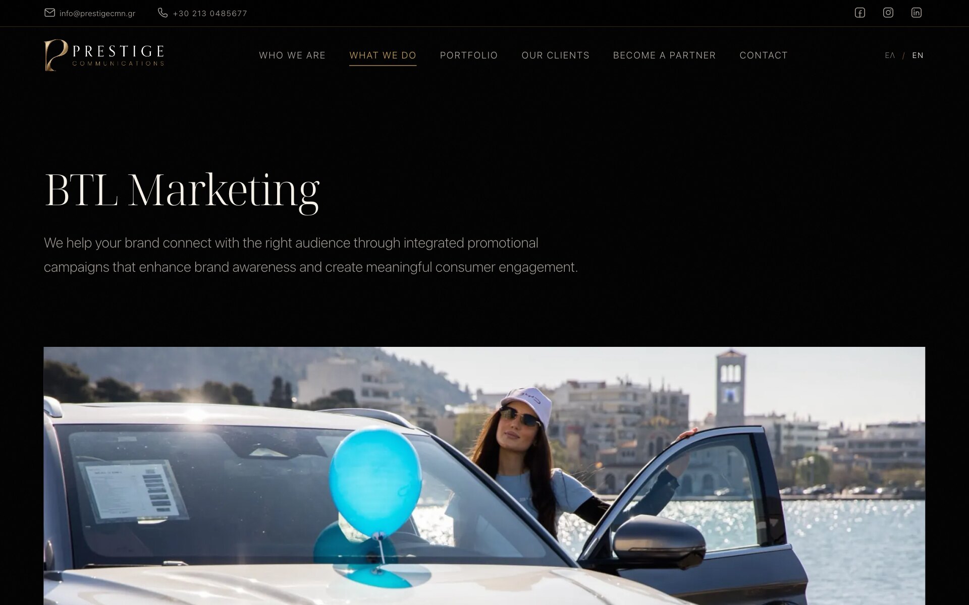
BTL Marketing — Opening on the Agency's Own Photography
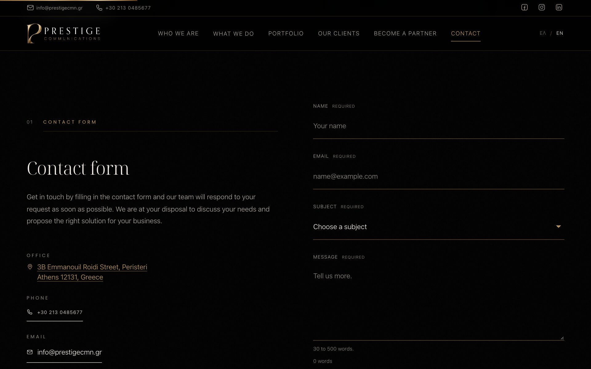
Contact — The Form, the Office and the Phone Side by Side
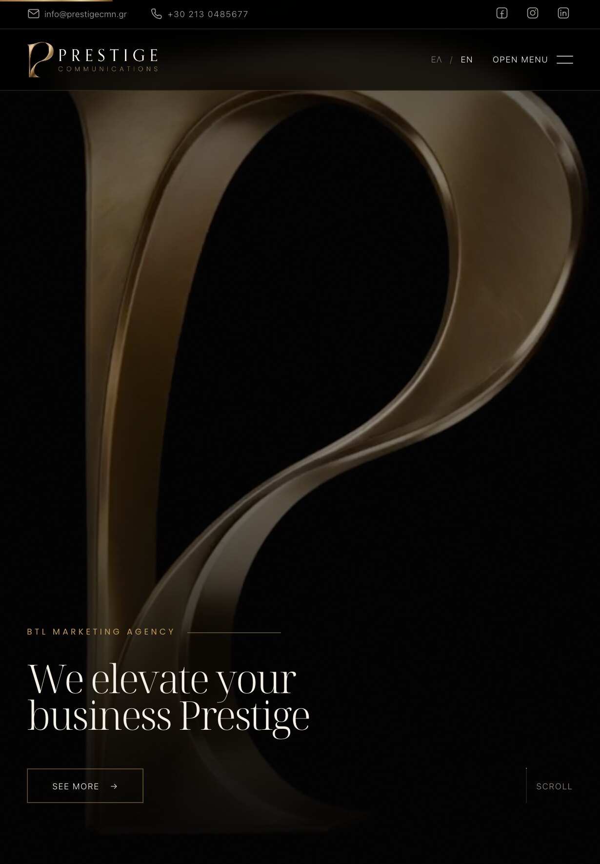
On a Tablet, the Monogram Fills the Whole Frame
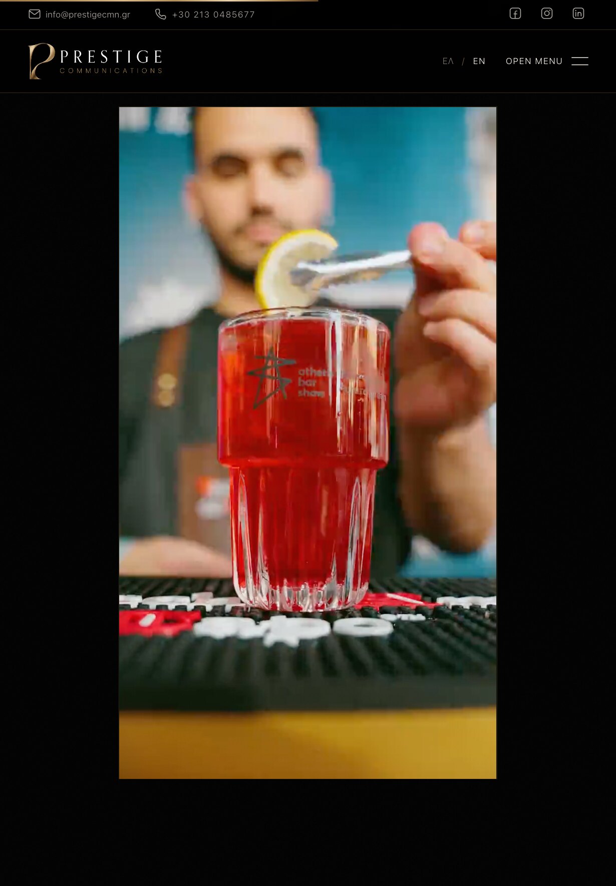
A Live Brand Activation, Played by the Scroll
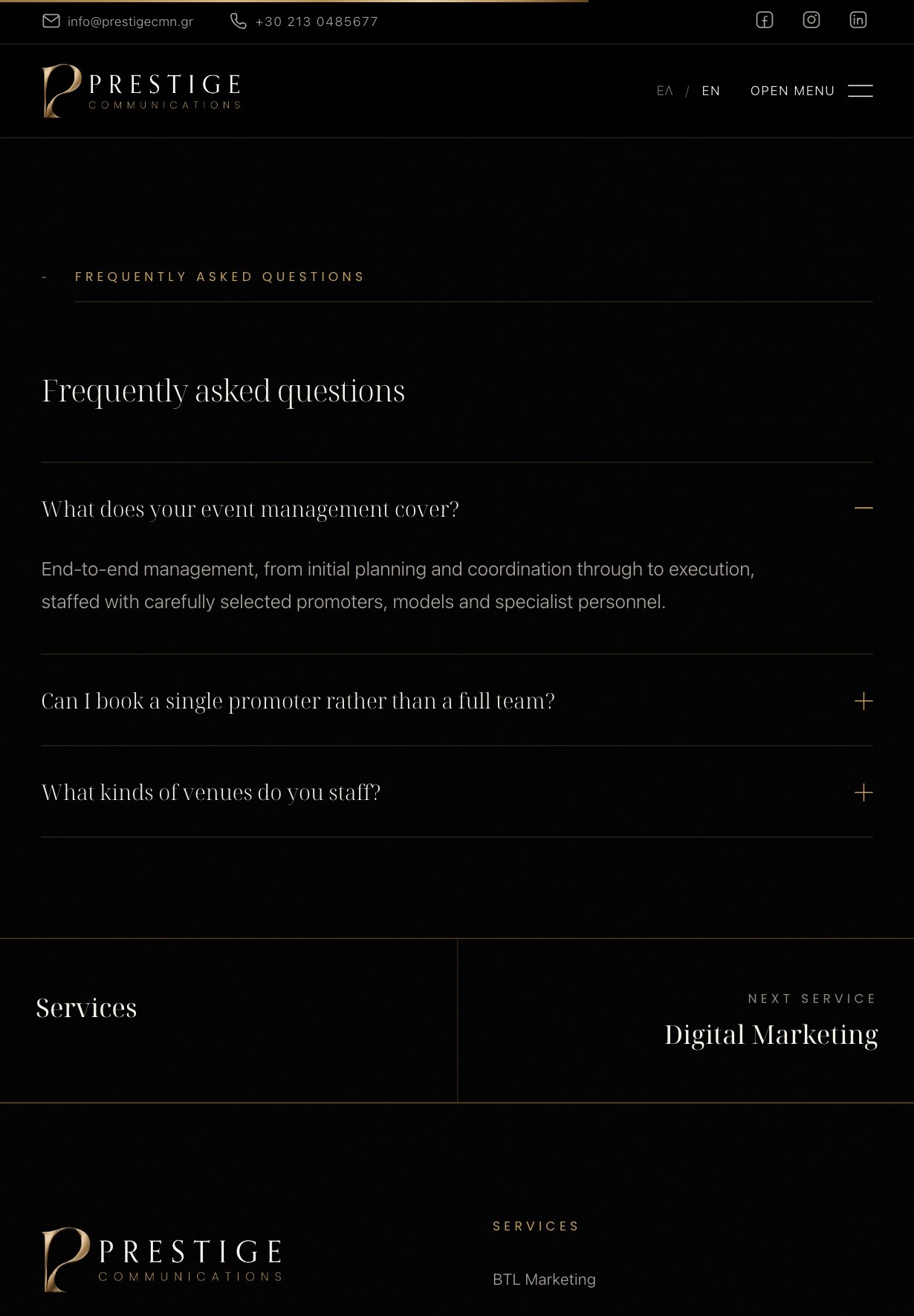
Each Service Answers Its Own Questions, Then Points to the Next
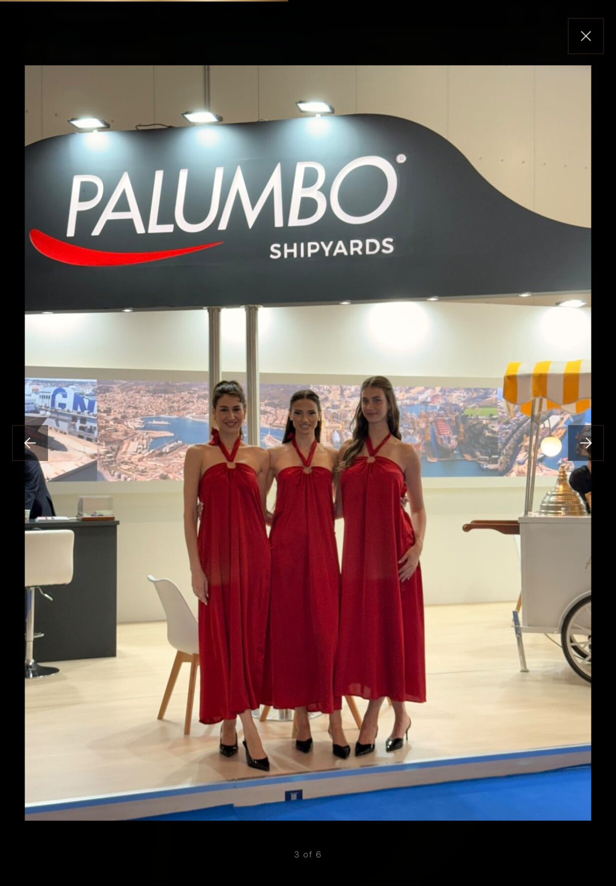
Any Photograph Opens Full Screen, With Arrows and a Count
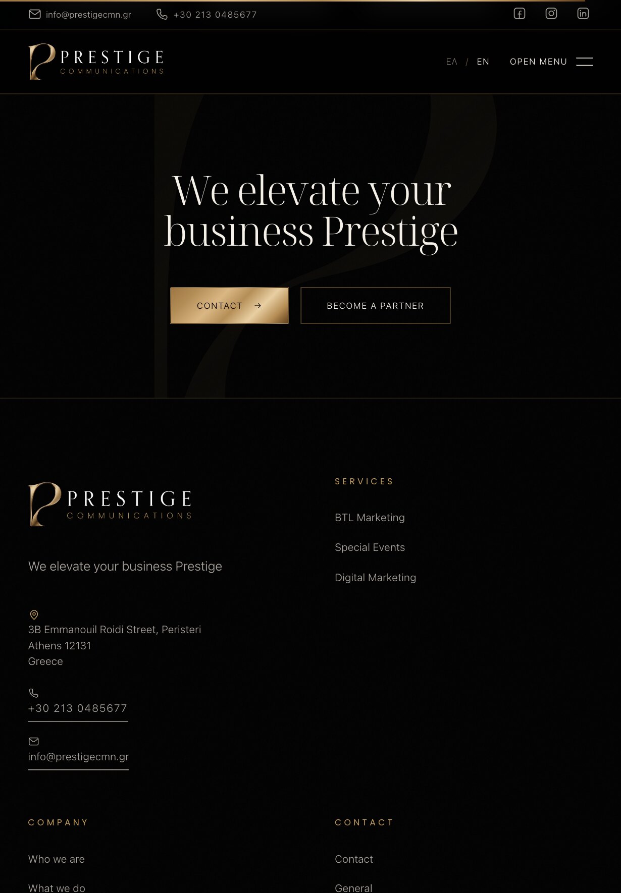
The Home Page Closes on Two Ways In: Contact or Join the Team
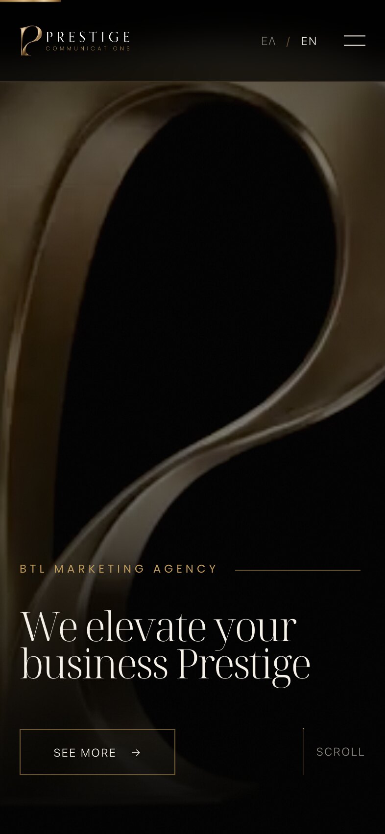
The Same Opening, Rebuilt for the Phone
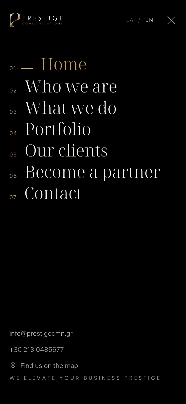
A Numbered Full-Screen Menu, With Email and Phone at the Foot
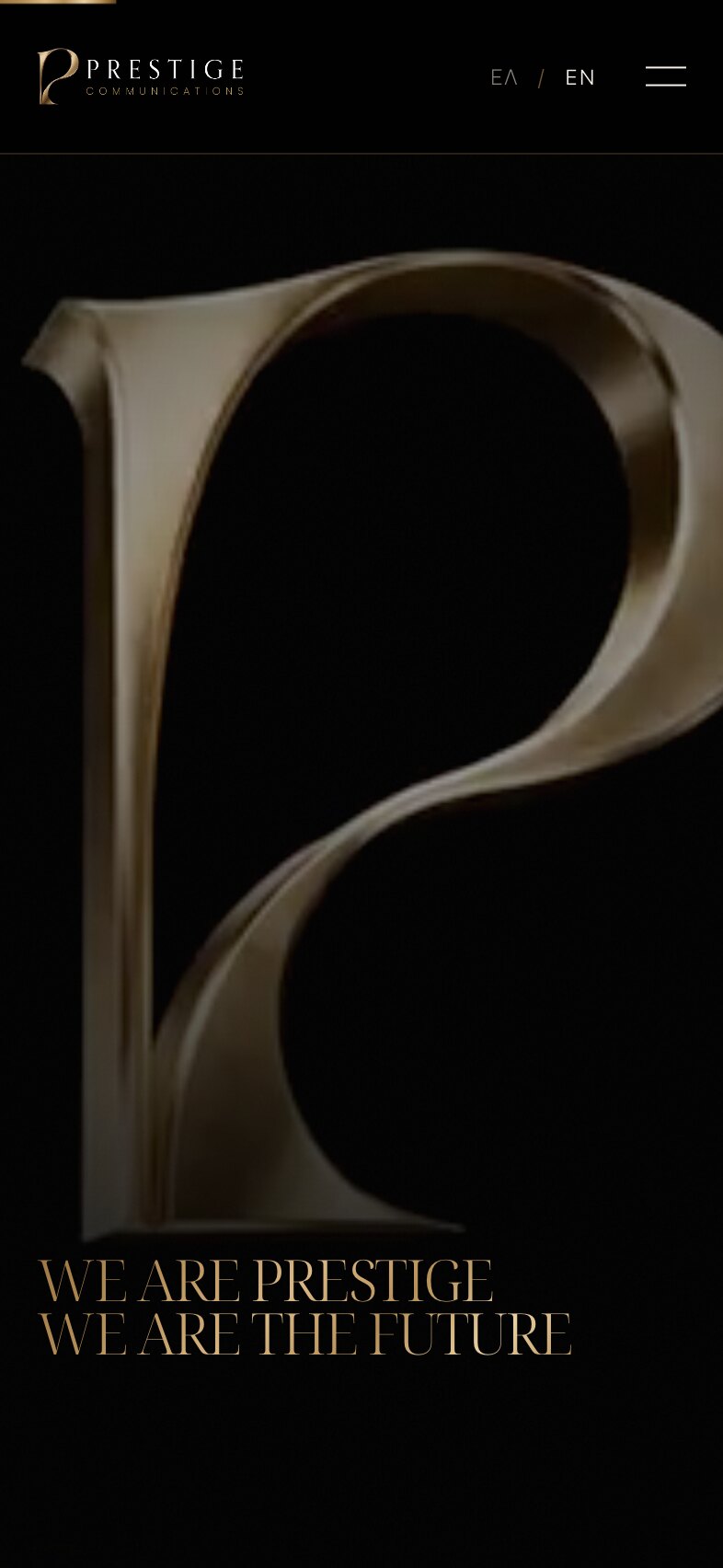
The Monolith, Scrubbed by a Thumb Instead of a Wheel
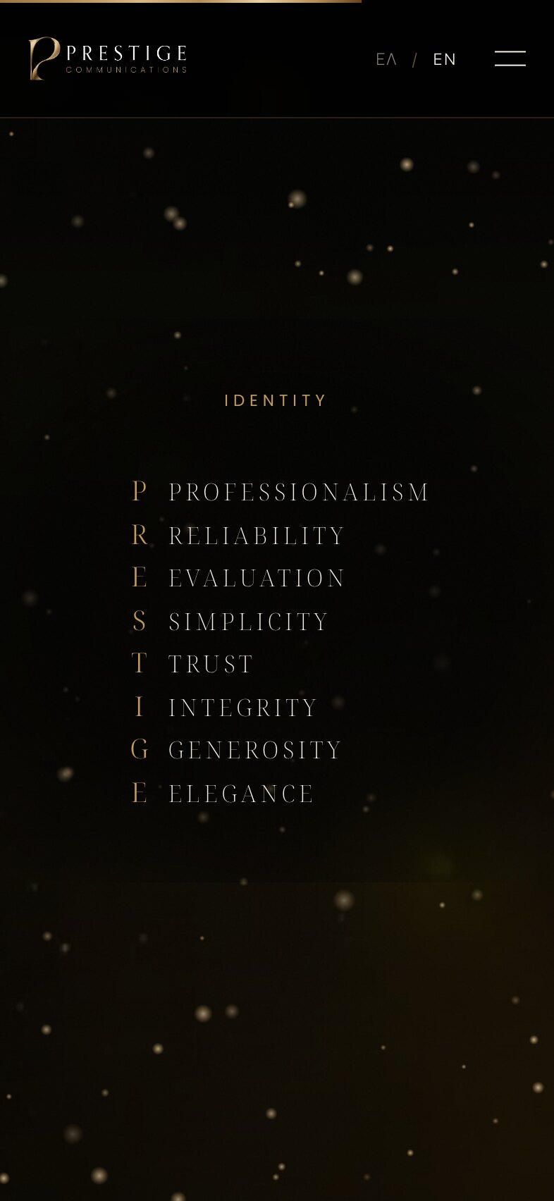
The Acrostic Complete: PRESTIGE, Spelled in Gold
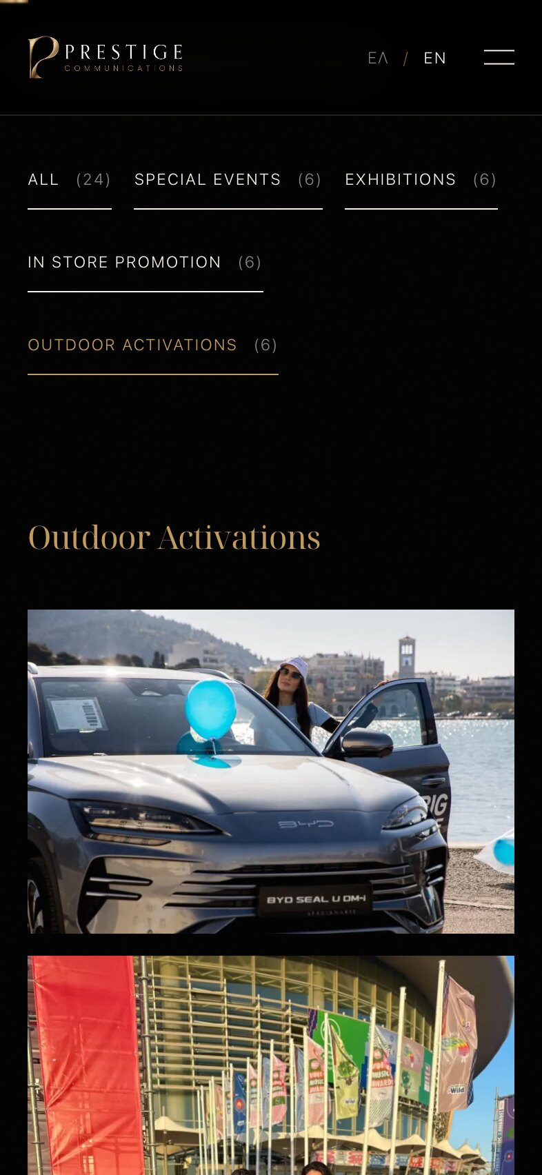
Filter the Work by Kind, With a Count Beside Each
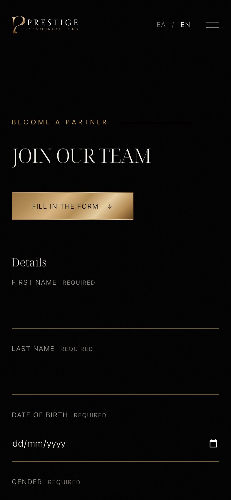
A Casting Application for Promoters, Hosts and Models
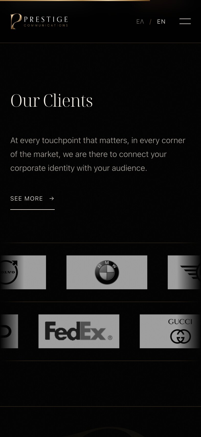
Client Logos That Drift Past in Two Rows
Brand identity
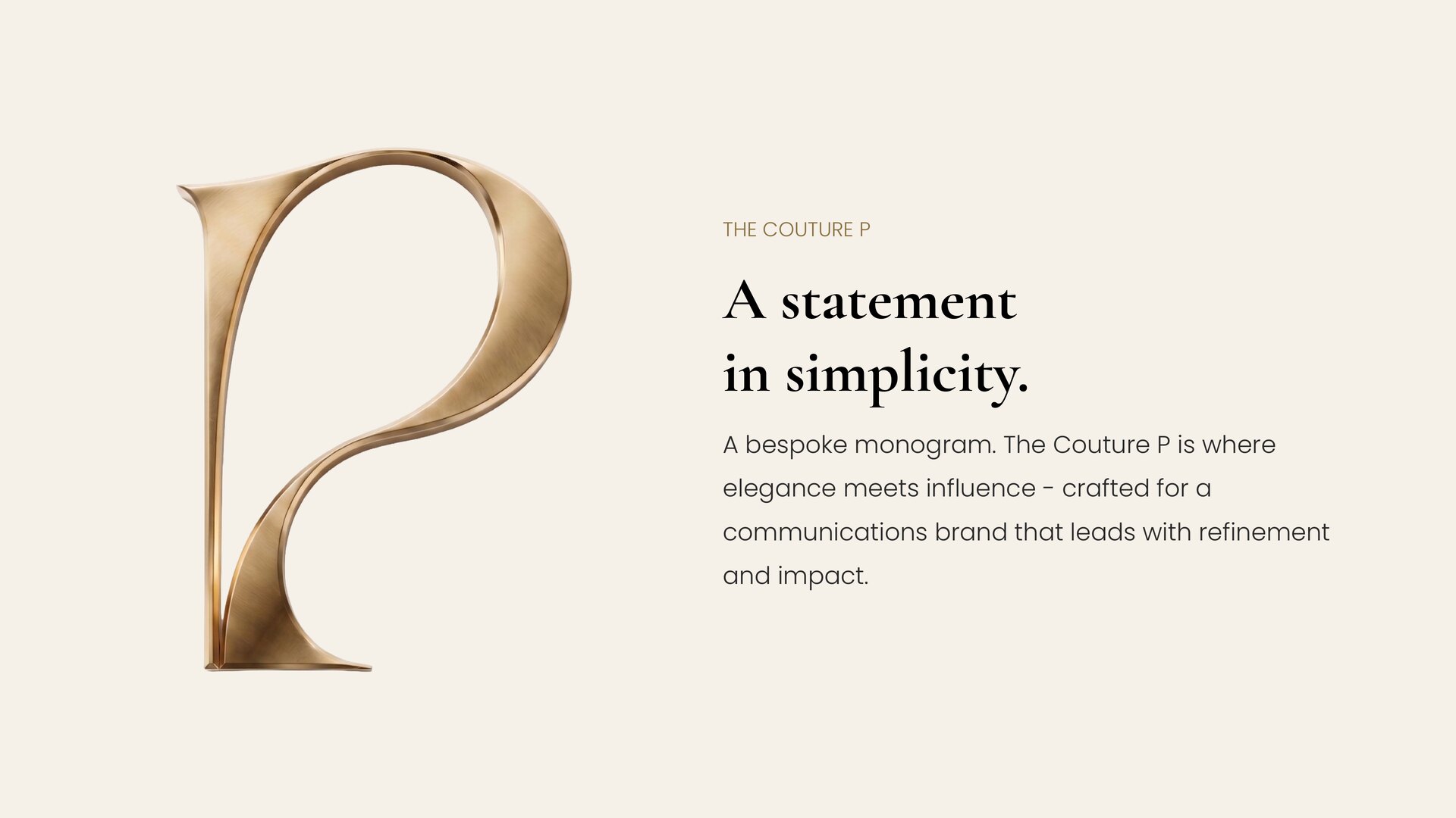
The Couture P — A Bespoke Monogram
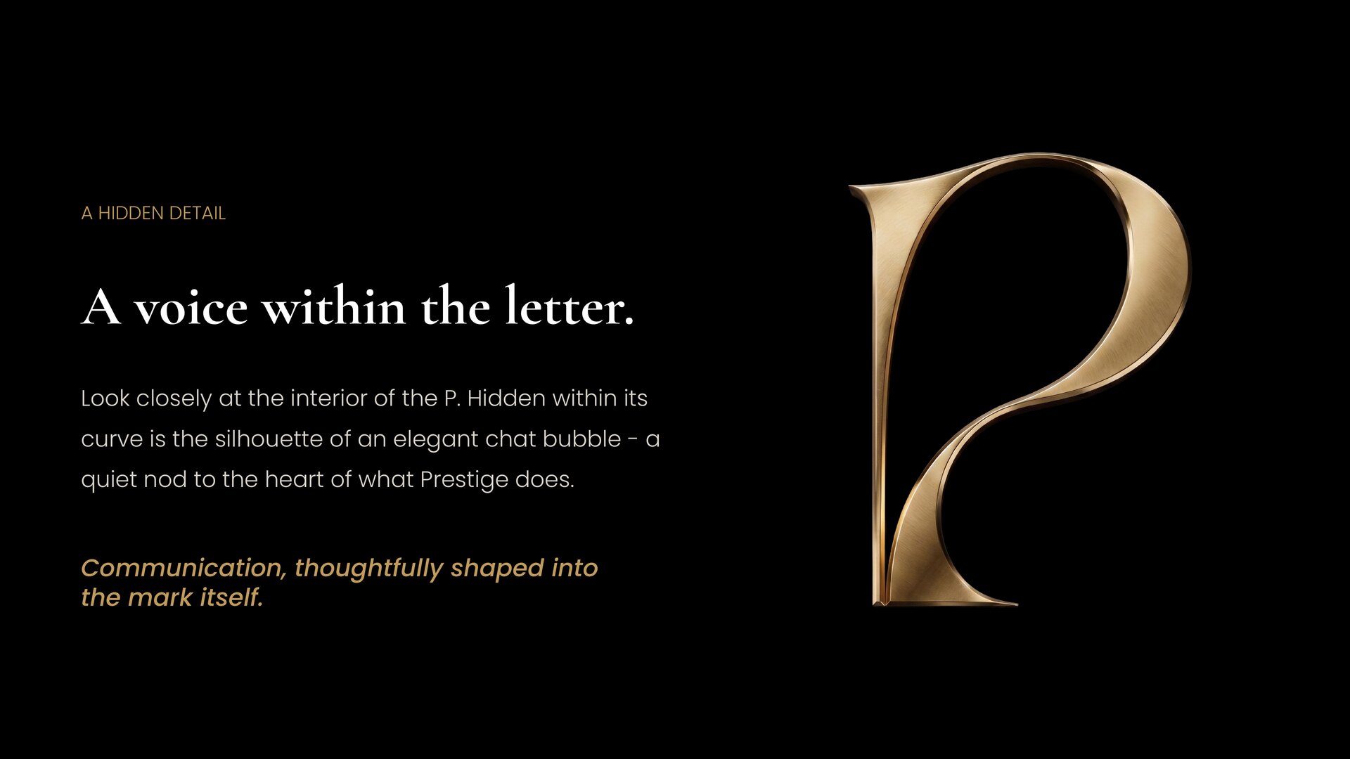
A Chat Bubble Hidden in the Curve of the P
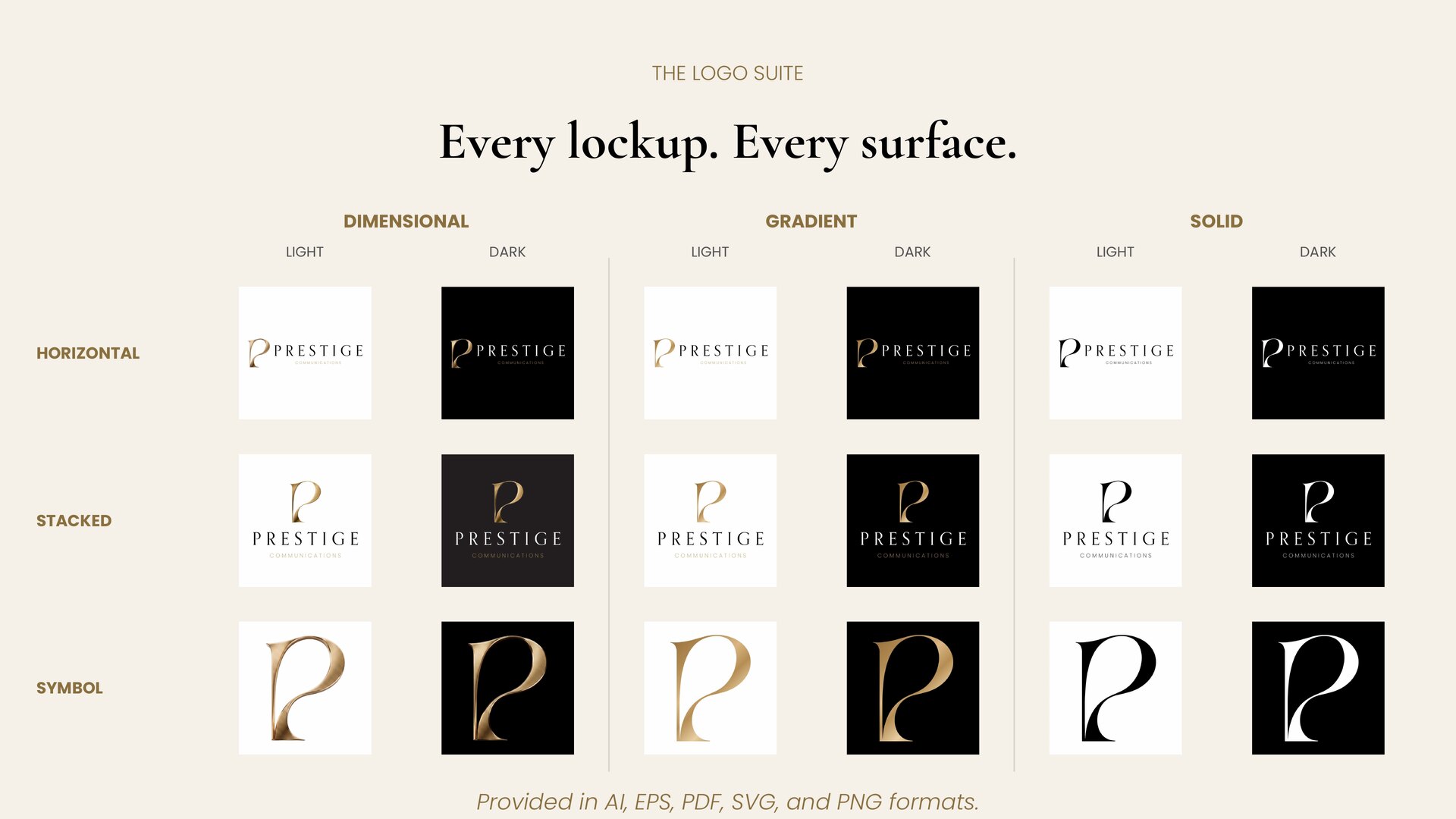
The Logo Suite — Three Lockups, Three Finishes, Light and Dark
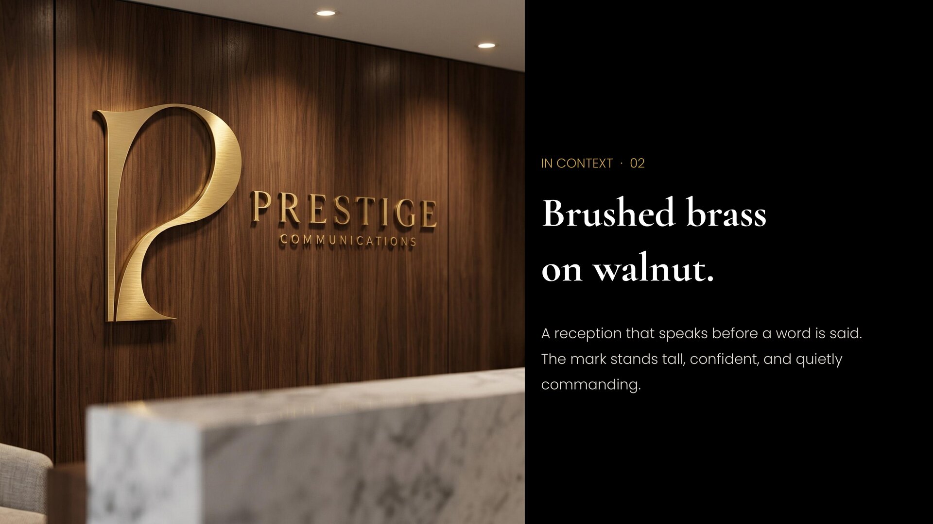
In Context — Brushed Brass on Walnut